First of all you need to setup Loyalty for eCommerce using this guide .
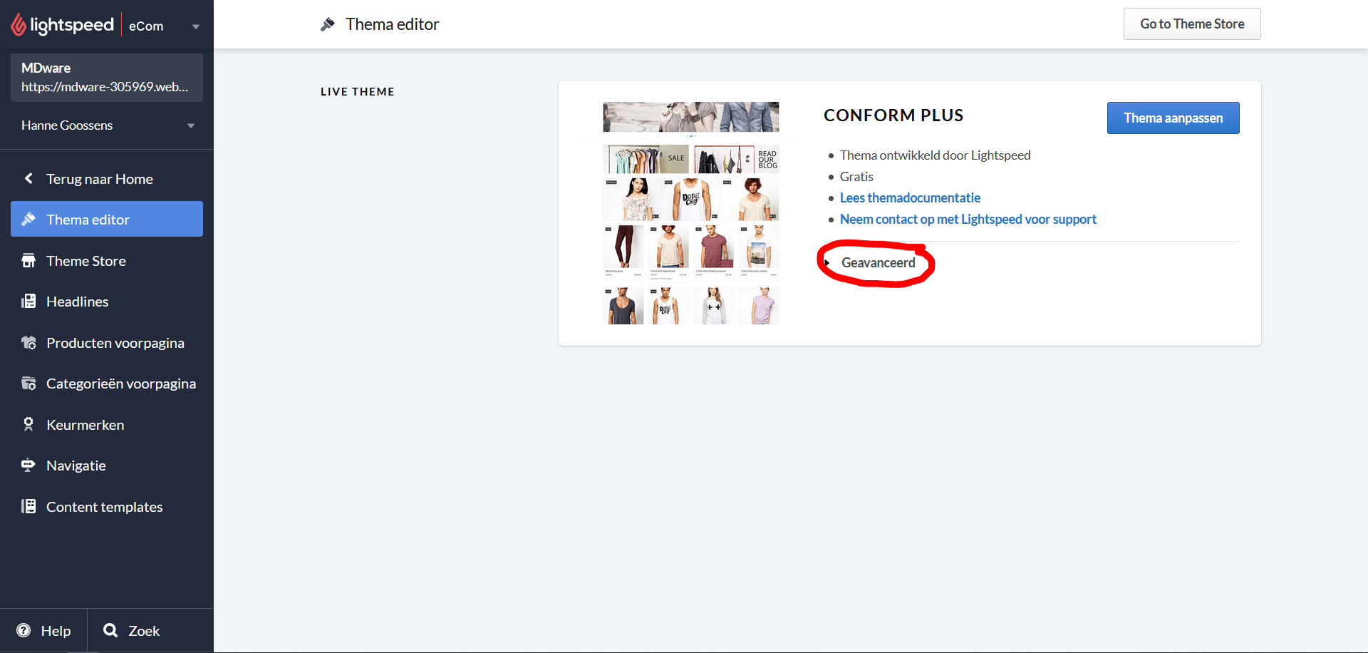
Go to 'Design' in Lightspeed eCommerce in the menu on the left.
On this page, click "Advanced".
5. Then click 'Modify CSS'.
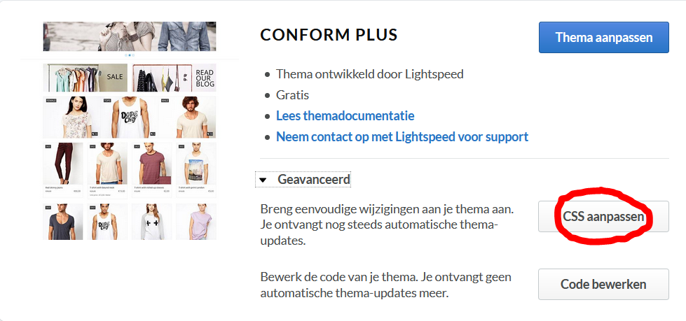
6. There you need to paste the following code snippet (modifications below):
@media only screen and (max-width: 768px) {
 .mdloyalty-launcher{
   ...
 }
}
Instead of the 3 dots, you will have to write some code that depends on your preferences. You can experiment a little with the numbers in the following examples until the button reaches the position you want. Do this by increasing or decreasing the number, save the modifications. Reload your website on your mobile phone and check what the code does.
If the button should be more to the left, you should add some margin to the right. This is done by writing 'right: 20rem !important;' instead of the 3 dots. Your code would then look like this:
@media only screen and (max-width: 768px) {
 .mdloyalty-launcher{
  right: 20rem !important;
 }
}
This should have caused a displacement like this:
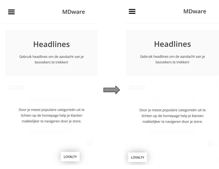
If the button should be more to the right, you should add some margin to the left. This is done by writing 'left: 20rem !important;' instead of the 3 dots. Your code would then look like this:
@media only screen and (max-width: 768px) {
 .mdloyalty-launcher{
   left: 20rem !important;
 }
}
This should have caused a displacement like this:
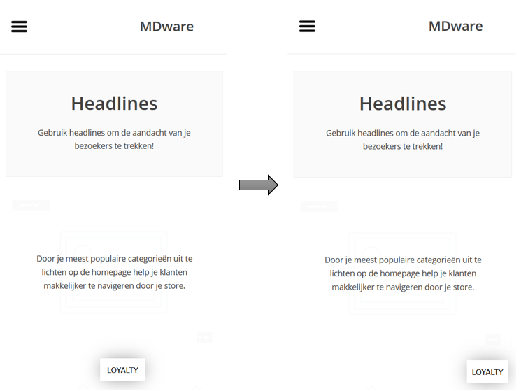
If the button should be more upwards, you should add some margin to the bottom. This is done by writing 'bottom: 5rem !important;' instead of the 3 dots. Your code would then look like this:
@media only screen and (max-width: 768px) {
 .mdloyalty-launcher{
   bottom: 5rem !important;
 }
}
This should have caused a displacement like this:
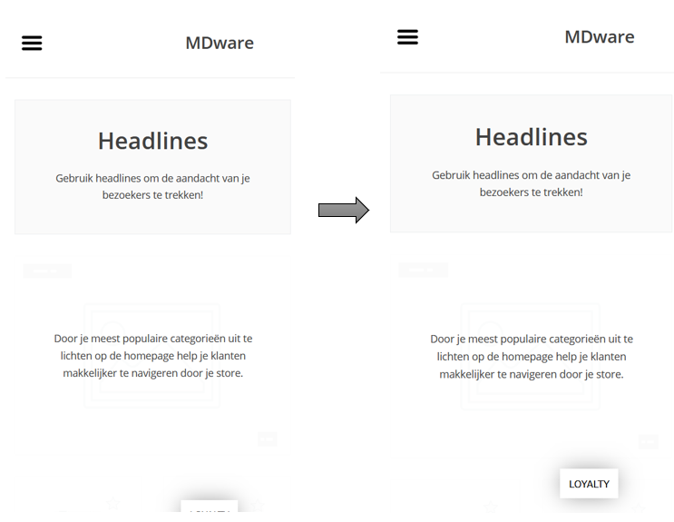
Combining two or more of these types of margins is possible. If your button should be more upwards and more to the left, you could write:
@media only screen and (max-width: 768px) {
 .mdloyalty-launcher{
   bottom: 5rem !important;
   right: 20rem !important;
 }
}
All done!
Do not hesitate to contact us if this does not work as expected.